
5 Essentials Every Homepage Should Include
Because first impressions online matter way more than we think.
Let’s keep it real: Your homepage is the front door to your business.
If it’s confusing, cluttered, or just “meh,” most people won’t stick around long enough to see how amazing your offer really is.
The good news? You don’t need a fancy website or a thousand-dollar design to create a homepage that works—you just need the right elements in the right place.
Let’s break down the 5 things your homepage must have if you want to keep visitors interested (and actually clicking).
1. A Clear Headline That Says What You Do (and Who It’s For)
If your homepage only had one sentence, this would be it.
Your headline should clearly say what you do and who you help.
No cute wordplay. No fluff. Just clarity.
Think of it like your elevator pitch—but shorter.
Example: “Helping busy entrepreneurs launch stunning, high-converting websites using simple tech.”
If someone can’t figure out what you offer in 5 seconds or less, they’re gone.
2. An Easy-to-Find Call to Action (CTA)
Let’s not play hide-and-seek with your buttons, okay?
Your homepage needs a clear CTA—and it should be one of the first things people see.
This could be:
Book a call
Download your freebie
Shop your offer
Join your email list
Pick ONE main goal and make that button visible above the fold (aka: before they scroll).
3. Visuals That Match Your Brand
First impressions aren’t just made with words—your visuals do a lot of the heavy lifting.
Use branded photos, mockups, or screenshots.
If you’re the face of your brand, include a friendly, professional photo of you.
Got a digital product? Add mockups that show it off.
Visuals build trust, reinforce your vibe, and help people feel more connected.
4. Social Proof or Credibility
Real talk: People trust people who other people trust.
If you’ve worked with clients, sold products, or even gotten a few kind DMs—use that!
Here are a few quick ways to build social proof:
1–2 short testimonials
A row of logos from clients or features
Screenshots of results or reviews
Even one solid piece of feedback can boost confidence in your brand.
5. Clean, Mobile-Friendly Navigation
If your site is hard to use on a phone, you’re losing visitors fast.
Make sure your menu is:
Easy to find
Simple (stick to 4–6 links max)
Mobile optimized
Also double check your footer—add links to social media, your email/contact page, and maybe even a mini FAQ.
The easier it is for people to find what they need, the more likely they are to stay.
Don’t Overthink It
Listen, your homepage doesn’t need to be perfect—it just needs to work.
When you keep it clean, clear, and strategic, people feel that. And that’s what gets them to stay, explore, and eventually say YES to your offer.
Need help designing a homepage that actually does its job?
Check out my website done for you service below —I’d love to help.
Website Done for You?
Yes Please.
Want a clean, custom-designed Systeme.io website that reflects your brand, connects with your audience, and makes sales easier? Click below to check out my Website Special and get your business online—the right way.

Let's get social!


BLOG CATEGORIES
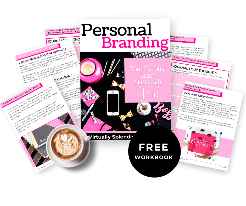
Free Resource:
Personal Branding Workbook
Learn how to build a brand that attracts. This free guide walks you through key steps to craft a personal brand that connects, converts, and stands out online.
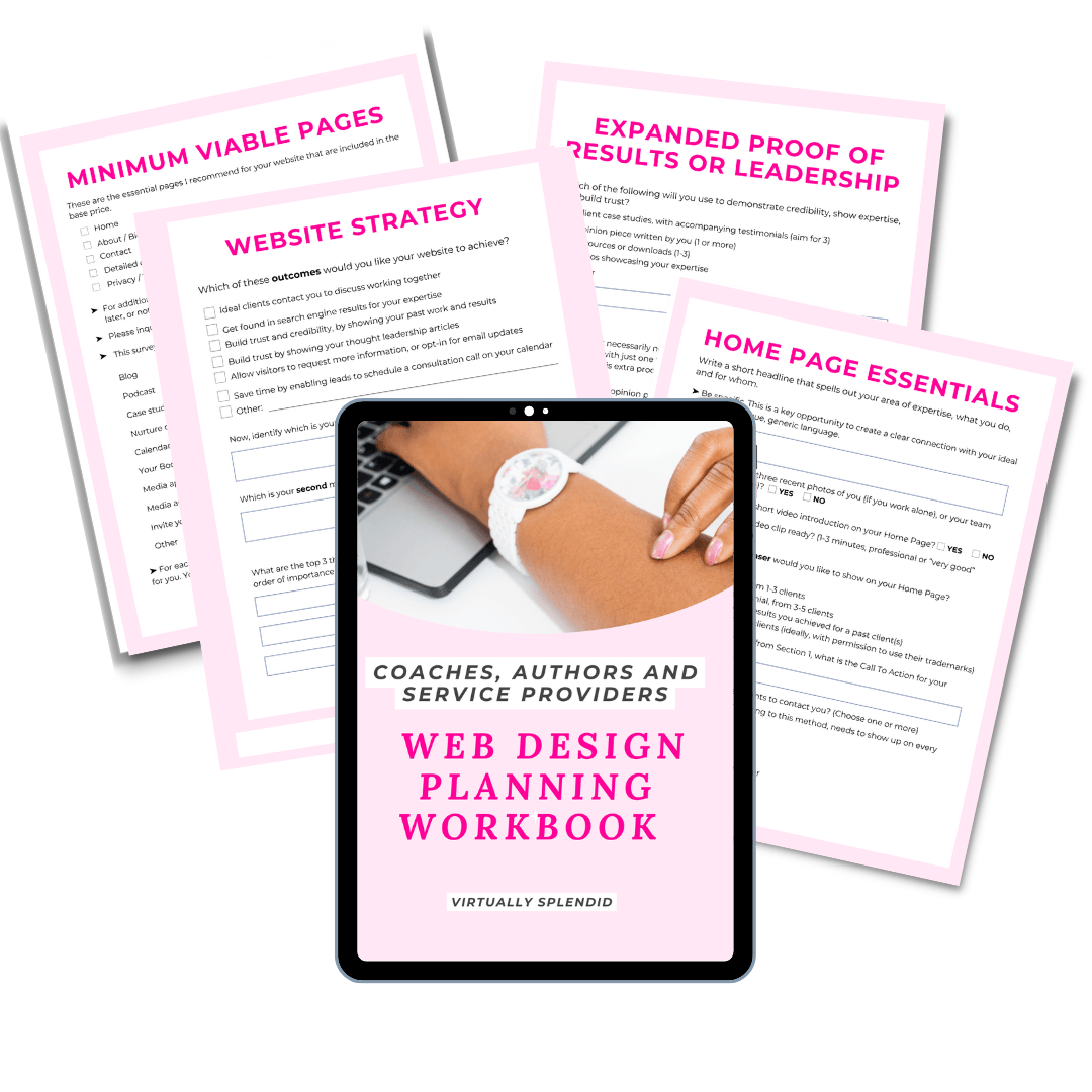
Free Resource:
Web Design Planning Workbook
Feeling stuck on what your website actually needs? Download my FREE Web Design Planning Workbook and get clear on your vision before you design a single page.
Created by Virtually Splendedwith © systeme.io